Showing posts with label computers. Show all posts

Sunday, July 24, 2022

Is a tape measure a constant force spring?

I recently came across a video of tape measures "racing" along a board of wood as they retract. Who doesn't love extending the tape as far as you can and recklessly letting it fly in? It obviously accelerates dramatically. Like any physics-minded person I got to wondering if the force is constant. How might we assess?

I'm home for the summer, a summer I desperately needed, and away from some of my usual tools. No probeware. No students to help. First I put a small bucket with a handle on a food scale from our kitchen. I extended the tape measure and used it to pull up on the scale. The force was somewhat constant, but not as steady as I would like. A force probe would have been handy to average many data points and see the force graphically.

Perhaps it would be simpler to measure acceleration, rather than measuring force directly. We could replicate the original video. But what about friction? I've also noticed that tape measures sometimes stick when used in this position. What if we pulled a cart of known mass and analyzed the video? The toy cars at my disposal were all too light—or had too much friction—to provide a motion that was slow enough and consistent enough to satisfyingly measure with the tools on hand.

But there it was staring me in the face: the air hockey table. I put the tape measure on its side, so that the weight of the extended tape doesn't cause it to rub as much against the tape (tape retracts more smoothly). Lego base plate floats beautifully on table. A few Lego bricks are placed on one end of the plate to hold the hook of the tape measure during retraction.  

Saturday, May 05, 2018

RL Falstad Circuit

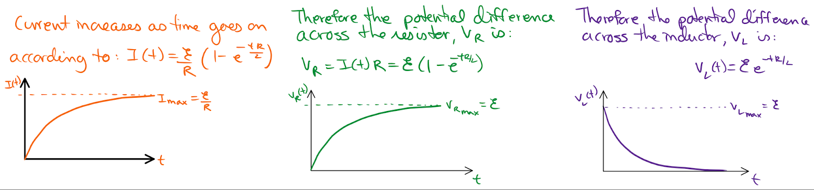
During my electromagnetism unit in my AP Physics C course I wanted my students to investigate a resistor-inductor circuit to reinforce the relationships for potential difference and current. Resistor-inductor circuits and resistor-capacitor circuits share a lot of similarities, including difficult-to-derive equations. While the derivations are a bit complicated they follow a similar format and once students have some practice they should see a pattern. Here is a write-up I made for my students for the resistor-inductor circuit equations. I tried to emphasize the patterns of decay and rise of each to reinforce the behavior of the current and potential difference over time. In a resistor-inductor circuit the current is initially zero when the switch is closed as the inductor produces an emf equal to the battery but in the opposite direction. We say that the inductor acts like a broken wire when the switch is first closed. Over time the current rises exponentially and the inductor produces a smaller and smaller emf until eventually the inductor acts like a solid conducting wire. As the current rises, so does the potential difference across the resistor.

As the switch is left closed for a long time the current of the circuit reaches the maximum current as if the inductor was not there at all. If the circuit can be completed without the battery then the inductor will initially produce the same current as before the battery was removed. The current decays over time, therefore the potential difference across the resistor does as well.
When my students were learning about resistor-capacitor circuits I had them use real lab equipment and confirm the potential difference and current equations they had derived. But I did not have inductors to use in a lab for a resistor-inductor circuit. I found this Falstad simulation and it is amazingly powerful. You can make any complex circuit you want! Below is one I mocked up for a homework problem. I screenshot the circuit and added more text to explain it to my students.


I constructed the circuit I wanted my students to explore and exported a link to the circuit. That is something I plan to do again; I can construct a problem-specific simulation and save that simulation forever as an exported link or screen capture. In the #GraphFails post I shared some terrible excel graphs my students had made. Since they obviously need more Excel practice I also decided to make a portion of this lab an Excel lesson.

Students started by drawing a Resistor-Inductor circuit and the appropriate meters to measure the potential difference across the inductor, resistor and the current through the circuit. They were to pick any value they wanted for the battery, resistor, and inductor. They used those values to write specific equations for the potential difference across the inductor, resistor and current when the switch is first closed and then as the switch is moved to exclude the battery. They calculated the time constant and maximum current for their circuit.

Students then opened either Excel or Google Sheets to create their data. I taught them how to make a data table and apply simple equations to fill in their data tables. The equations for resistor-inductor circuits were not the easiest thing to learn to type into a spreadsheet so my instructions included a simple method and a more complex one. By graphing their data students were able to confirm that their equations and data were correct if the shape of their graph matched their expectations.
Students learned to label all the parts of their graphs, resize them, change their legend, etc. They printed out their data tables and graphs for both the rise and decay of current.
The final step was to follow the link to the Falstad simulation and create their circuit. Since I had set the circuit up students just had to right click on each element to change the values to what they had set up in the beginning of their lab. Students then ran the simulation watching the current rise and then change the switch after it leveled off (after 5 time constants) and decayed. They were able to pause the simulation and doublecheck that their values determined by equations matched the simulations.

Overall I felt like it was a successful lab simulation. Students practiced complex equations, double checked their graph predictions with computations, learned how to use Excel/ Google Sheets to write equations, create multiple graphs and customize them, and created a visual of their personal circuit to see the values change with time. In the future I'd love to get a real resistor-inductor circuit lab going but I think that I would add it to this lab rather than replace it.

Lots of students surprised themselves with their accuracy, some getting too excited, "We have no error!" That was inevitably followed with the slow realization, "Wait, everything was done with equations ... we shouldn't have any error." No, you should not. So when a student did produce a graph that disagreed with their prediction they were able to work it backwards to find out where they had made a mistake. All in all Falstad may be my new favorite electric circuits simulation. Shhhh.... don't tell PhET. ;)

Tuesday, January 24, 2017

Crash cushions cont.

Several years ago Dan Burns and I started discussing an engineering project for which students build a crash cushion to investigate momentum and impulse. Using only a few sheets of paper and hot glue student groups design crash cushions (similar to water barrels or guard rails on roadways) to lower the force experienced by a cart rolling down an incline that crashes into them.

Since then we have both completed the project with classes albeit differently. We also presented at the Summer 2016 AAPT meeting in Sacramento, all of the materials discussed there are here. I wanted to share the project here again, with the tweaks my partner Jon Brix and I have made to it since.

My colleague Matt Miller continued the project in Conceptual Physics this year although opted not to use the Vernier sensor that I had last year.  He opted for the resettable Drop N Tells I bought years ago instead as it is more visual for the younger students. He set up a ramp and used a lightweight impact car that had an additional <200 grams of mass added. Miller adjusted the ramp set-up until the 25, 15, 10 and 5-g sensors were consistently tripping. His students were challenged to design the crash barrier that did not trigger all the sensors. I believe he set the grading up this way:
C = triggering the 15, 10 and 5-g sensors
B = triggering the 10 and 5-g sensors
A = triggering only the 5-g sensor
Extra Credit earned for not triggering any sensors.

Dan uses a PASCO Smart Cart while I use Vernier sensors. The first year I tried this I used a low-g accelerometer because it was what I had. Through a Donors Choose grant I was able to purchase the higher 25-g accelerometer3-axis accelerometer and a Wireless Dynamic Sensor System (WDSS). The wired sensors require some coordination to prevent the cord from catching but are workable. I found that the wireless WDSS made for easier set-ups but would disconnect occasionally. Both the WDSS and the 3-axis sensors were almost too accurate and the graphs produced were difficult for students to interpret. I opted this year to use the single-axis 25-g accelerometer because even collecting 500 samples per second the peak accelerations were easier for students to determine.

In the past I've used a wood ramp and a big heavy dynamics cart that then travels along the flat lab bench into a wall. The transition from ramp to flat tabletop caused additional acceleration peaks so we opted to have the cart run directly into the wall from an incline. The heavy cart and steep ramp produced a high acceleration that exceeded the accelerometer's limits. We decreased the ramp angle and still occasionally "missed" the hit because the time of impact of the cart against the wall was so short. This year we opted to use a low-friction (not smart) PASCO cart and track from another colleague. The 120 cm long track was raised above the table by one textbook and pushed against the wall. A box of weights (over 30 lbs) was pushed against the higher end of the track to prevent it from moving. In initial tests the conservation of momentum caused the track to move quite a bit when the cart struck the end of the track.

This year student designs proved very successful. Because of the light cart and small incline students were able to reduce the acceleration of the cart at impact fairly easily. Usually the designs that "failed" did so because the cart passed underneath the crash cushion and still struck the wall. I had only one set-up in the classroom so groups took turns testing their barriers and collecting data. We stored a trial of the cart running into a book at the end of the ramp and then printed out graphs for each group with their trial on top of the control data. Here is an example of the data student's received with the control (green) and their trial (blue):
Students were to take measurements of their crash cushion before and after their collision although most cushions did not permanently deform. For some reason students were very pleased when their crash cushion suffers little damage; several cited the fact that it could be reused as a positive attribute. Students were also to calculate the Force with and without their crash cushion based on the mass of the cart.

Using this information students were to write a Claim, Evidence, Reasoning (CER) conclusion to answer the question: "Was your crash cushion effective?" After grading these conclusions we realized a few things:
1. Students did not agree on what made a crash cushion effective. Most students realized that decreasing the force, as shown on their graph as a decrease in acceleration, by increasing the time of impact made for a successful crash cushions. A few more realized that stopping the moving cart without letting it bounce back was also good. Yet many students considered their crash cushions ineffective if there was any acceleration, even if they reduced their force by more than 50% .
2. Students do not know what is fact vs. opinion. This must be going around recently. Students often stated opinions or qualitative observations in place of specific measurable data. "Our crash cushion was good because it stopped the cart slowly."
3. Some students did not understand the graph axis, significance of peaks, etc. Referring to the example above, some students incorrectly described the "time of impact" to be just over 2.5 seconds for the control trial. They did not understand or forgot the fact that the cart had to roll down the ramp before the impact.
4. When in doubt, students are prolific. I expected three, maybe 5, sentences from students yet often received a full page. While grading these conclusions I often crossed out over half of what was written because it was superfluous. They seemed to just keep writing and praying for partial credit.

Before handing back their conclusions I reviewed the CER format with students and showed them a few pictures of correctly written (short) examples of their peers. I showed them a few sample graphs from their trials and reviewed the significance of each peak. In the future this will be done the day after to give students a chance to correct their CER conclusions before turning them in.

Sunday, October 16, 2016

Forces Match Graph: The Presidential Election Challenge

Untitled

I developed an activity using force sensors to create a visual representation of Newton's Third Law.

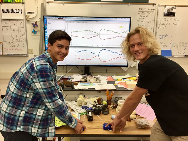
The activity includes a brief exploration of the force sensor, then engages students within lab groups to conduct miniature tug-of-war sessions using the force while the computer records force vs. time data to plot a real-time graph.

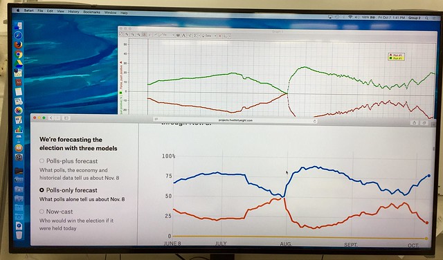
The symmetry of the plots revels that whenever one object exerts a force on a second object, the second exerts a force on the first that is equal in magnitude and opposite in direction.

The plot also resembles the "probability of winning" graphs produced by Nate Silver's FiveThirtyEight team.

So I challenged early finishers of the lab to try their hands (literally) at reproducing the Presidential graph using force sensors. I thought the students did a fine job of it.

Untitled

Here's the student sheet for the activity. It's adapted from the one included in the Conceptual Physics lab manual authored by Paul Hewitt and me.

The Force Mirror

Nate Silver's graphs can be found at FiveThirtyEight.

Thursday, September 08, 2016

New goals & gravity oops

My regular Physics class starts the year with basic graphing skills and learning how to interpret graphs of motion. Tuesday we used Vernier Picket Fences and Photogates to determine the acceleration due to gravity.


Usually the next day I have students create another planet or moon in our Solar System to create the same graphs based on their acceleration due to gravity (activity here). Starting with the acceleration-time graph (constant horizontal line) students find the area under the curve to plot the velocity-time graph (line with a positive slope) and the area under that curve to plot the displacement-time graph (a power curve).

By this time in the unit my students understand the relationship between the three graphs for something moving with a constant acceleration. They've even graphed something similar by hand; and they saw the same shape with their lab (above). So I found myself wondering, "Why am I making them do it again?" I gave a small quiz last week and noticed that students were having trouble with tangent lines to approximate the slope of a curved line.

So I re-evaluated what I wanted students to learn/ practice with this activity:
- Students need to practice drawing accurate tangent lines and determining their slopes.
- Students should understand that while a constant acceleration creates a positive linear velocity-time graph and a power curve on the displacement-time graph the acceleration will not always have the same value.
- Students often find the area under the curve to find velocity from acceleration-time graphs but need practice finding the slope of a displacement-time graph to determine the velocity and eventually acceleration.

After reflecting on this I changed the activity. I took the acceleration due to gravity at the different locations in our Solar System and worked the data backwards to create the displacement-time graphs for each one. (data here) I printed out enough copies for students to work in pairs and laminated them; I also laminated graph paper. Students were given the displacement-time graphs Wednesday and asked to practice their tangent skills to determine the instantaneous slope at several points. They used these values to create a velocity-time graph on the graph paper using dry erase pens. Note: Overhead projector pens work as well and since they are finer tip would probably have worked better.


Students dove into it, determined to get very close values to the actual acceleration due to gravity. I soon found however that many were trying to use power regressions to solve it; I have quite a few students in AP Calculus. Others found the slope at the beginning and end of the curve, connected those two dots and called it a day. Students were calculating accelerations due to gravity for Mars or Mercury at 400+ m/s2! After some help around the room most students were better about using the tangent method, finding five to six points, paying closer attention to scale, and felt pretty good about their calculations. Yet as students came up to check their answers with me they were consistently twice as high as the actual value. Enough students had almost twice the values that I went back to check my data.

I had calculated d = at2 not d(1/2)at2.

As my students would say, *face palm*; I totally blame the toddler-induced lack of sleep. The students were doing it right (good) and they didn't really know the acceleration due to gravity on other planets anyway so they didn't catch my mistake (even better). In the end I decided it would be a good way of introducing the equation next week and discussing why it is so important to include that (1/2).

I've fixed the data (available again here) and the printing pages (pdf or google doc) and plan to do this again next year. I have very sparse grid lines; depending on your students' math level you might want to give them more grid lines. In the end students were able to practice a skill, broaden their understanding of a concept and I didn't have to grade anything. Aside from my miscalculation, it was a win all around.

Monday, June 20, 2016

A cursory examination of Perusall

I have been an admirer of Harvard physics professor Eric Mazur ever since I got a copy of his book, Peer Instruction, back in the late 1990s. I found that the more I implemented his teaching strategies in my physics class, the more my students learned.

I was excited when I heard he would be speaking at the teacher outreach event in San Jose hosted by the Optical Society of America. Most of his talk was from his famous “Confessions of a Converted Lecturer” speech that I have seen before. However, toward the end he announced a new initiative called Perusall.com. He said for Peer instruction to be the most successful, students need to do some preparation before coming to class. For most classes, this means reading a textbook or similar resource. The problem arises when only some students actually complete the reading assignment. Perusall was developed to solve this problem.

Students log in to Perusall and read their textbook or any pdf reading their teacher uploads. They can print it out or download it. As they read online, they can highlight text and graphics that confuses them and ask questions. They also can highlight and add comments that others might find interesting or useful. They can link to other resources that they think might be helpful. They are put in groups of 20. Their peers can see their highlights and click on them to see the question, comment, or other information. They can respond if they want to. As Dr. Mazur described this I thought, what a nightmare to grade. He then revealed that Perusall uses artificial intelligenence software to automatically grade comments. Each comment is assigned a 1, 2, or 3 depending on how it relates to the highlighted text. The instructor can download a spreadsheet that has the scores for each student.

After hearing this I knew I would have to try it. Perusall is mainly meant for use by colleges as an online textbook purchase. This wouldn’t work well for me because I recently purchased new physics textbooks. I couldn’t ask my students buy it online. I decided to select readings from the open source physics textbook found on Open Stax. I asked Perusall for an account and they set me up for free. I uploaded my first reading for our circular motion unit. I perused the help files on Perusall and uploaded some so students could more easily find them. I gave out the login information and waited to see how my students would respond.

The response was very positive. The comments started appearing right away and they looked thoughtful and helpful for the most part. As we did more assignments, they got better at pleasing the artificial intelligent agent and got higher scores. I posted some example “3” and “1” comments so they could see what was deemed good and not so good. One problem is they don’t see the score of a comment until the assignment ends. I found I could release the grades early, allowing them to get feedback and respond to it by adding more comments are editing the ones they already did. I wouldn’t do this for every assignment but it did help them improve their skills for this new learning tool. I made short screencast showing the comments on the circular motion assignment:


I did not do any formal research about the effectiveness of Perusall on my student's learning or engagement. I do know that most of my students actually did read the assignment and posted hundreds of applicable comments. Mazur did research of Perusall use at Harvard and found that it was effective. He also said they ended the study early because the students without Perusall were complaining when they saw what their friends were doing in the other physics sections. This study has not been published.

Perusall is such a new and different tool that I thought it would be a good idea to let you try it out. You can join a class I set up for physics teachers and others that are interested. Just go to Perusall.com, create a login with the 3 options or using your email address, then enter the access code: BURNS-2858. Your assignment will be to read and comment on a physics education research paper by Joe Redish called "Changing Student Ways of Knowing". I will make it due on 9/1/16 and release the grades after that and several times before. I also uploaded some of the documents I made available to my students that give more information about using Perusall.

If you would like to give Perusall a try I urge you to contact them and ask if you can use it at no cost like I have been doing. Any public domain textbooks or articles in pdf format can be used. 

Thursday, March 03, 2016

How far is it EXACTLY?

It is often difficult for students to understand relative distances or speeds of objects. It is even harder to go against their ingrained accepted English system of measurements by making them use *gasp!* the metric system. I've been guilty of it numerous times myself by trying to use round, easy to square root numbers in my problems only to have a student raise their hand and meekly ask, "Wait, wouldn't that be as high as the Empire State Building?" or "Wouldn't that break the sound barrier?" etc. Sometimes we go for realism and sometimes I just want them to be able to do the problem quickly for practice.

I've found a few times that using Google Maps is helpful to create maps for scale. At the beginning of the year students practice their understanding of scale with this Group Measurement Activity (pdf or ppt here). I've incorporated images from Google Maps before for lectures on measurement but they have not been interactive. I just made this map (at right) of different distances from 50 m to just under 2000 km using our campus as the 0 m mark. You can view the distances in two layers, <5 km and <2000 km.

I just came up with this strategy for my Physical Science class when we studied the layers of the Earth. I gave each student a printed map of the US and showed them this map (below) with different line segments representing the average thicknesses of the different layers of the Earth. Students were able to transfer the lines to their own map.


While the level of students necessitated this format, I would like to try having students find their own lengths for these thicknesses. Using laptops or tablets students would be able to make their own Google maps based on these thicknesses, or any other values I want them to gain an understanding of.

One of my favorite random facts about the electromagnetic spectrum is this quote from a NOVA documentary: 
“This understanding of planetary processes is based upon data from satellite instruments spanning a wide range of wavelengths of the electromagnetic spectrum, almost all invisible to the eye. As one scientist explains, if the electromagnetic spectrum were stretched the three thousand miles from New York to California, what we can see in the optical range would take up the space of a dime."
While I have used an animation within Powerpoint to illustrate this in the past it is not to scale. While I was playing around with maps, I created a quick map with only two parts: a line from Los Angeles, California to New York City, New York and a marker in the middle of an intersection in Wichita, Kansas. The distance from LA to NY ended up 2,450 miles but the scale is still impressive. I would show students the whole US and then zoom in on the green circle representing the dime on "main street USA" right in the middle of Kansas. The quote is interesting on its own, engaging as a simple picture but I hope it will be more powerful as an interactive map.

I've also started playing around with a map that compares the distance traveled by sound to the distance traveled by light but I'm quickly finding the difference in scale will be cumbersome. Its hard to compare sound (very fast) with light (faster than you can imagine something moving). What other ways could you use this tool in a science classroom?

Sunday, November 08, 2015

Keeping the real Apple Keynote alive

Apple officially discontinued development of its first-rate presentation software, Keynote, in October, 2013. The final version was Keynote 5.3, and was originally released as part of iWork '09. So some people think of it as Keynote 09 or Keynote 5. (MidCap enthusiasts errantly refer to the program as KeyNote.) I posted a death notice/rant here.

Confusingly, Apple now produces Google-docs-esque productivity software, including a presentation program named Keynote (technically, Keynote 6). The vast majority of legacy Keynote users despise Keynote 6 for many, many reasons. Apple promised to throw extant users a bone. Too little; too late. Or never. Apple lost the thread on what Keynote was supposed to be, and I have to presume they'll never get it back.

My school district does its best to keep teachers' computers from aging into obsolescence, so my 2010 MacBook Pro 13" was replaced this week with a 2015 MacBook Air 13". My own computer is a 2012 MacBook Pro 15". Making the new computer useful to me was not a trivial matter. Since it's not my own personal computer, I could not initialize it as a mirror of my "old" computer or restore from a Time Machine backup. But I did need fully functional Keynote 5. And I needed Keynote 6 not to be there: among the disasters incorporated into Keynote 6 is its tendency to automatically "update" working Keynote 5 files into broken husks (misshapen, ill-fitting Keynote 6 files).

So I do have a paid-for copy of Keynote 5.3 with a valid serial number/license key. (When Keynote is open, click the Keynote menu and select "About Keynote" to see the serial number/license key.) But the new Mac has the new Keynote installed and does not have the discontinued, functioning version of Keynote.

Here's what I did to ditch the awful Keynote 6 and install the functional Keynote 5 on a new Mac that wasn't really mine.

Step 1: Delete Keynote 6. Drag it to the trash. Empty the trash. Putting that terrible code-cobble out of its mystery should be the very first that one does at first light with any new Macintosh. Yes, really. Flush it now.

Step 2: Download the disk image (.dmg) for the iWork '09 free trial. (It works as of this posting; nothing on the Internet is guaranteed to work forever in the future.)

iWork '09 Free Trial Installer

I found the link on this page.

Step 3: Run the installer and install the software. This will get you to Keynote 5.0. But you don't really want Keynote 5.0. You want Keynote 5.3 with all the improvements that occurred between 2009 and 2013.

Step 4: Find and run the iWork 9.3 updater. I found the updater on this page. (Same caveat as above).

Step 5: Register the software with your serial number/software key.

So far, so good.

I did run into another problem owing to my old fascination with fonts. It turns out, I own and use a grand symphony of fonts. Horses for courses. I thought I successfully created a Dropbox folder with all the fonts in my computer's Library. (You then drop all the fonts into the new computer's Library/Fonts folder and opt to skip all duplicates. But opening Keynote documents revealed that my new computer was missing fonts I used.

I discovered the location of these fonts was in my User directory. But when I opened my User directory, there was no Library folder to be seen. I learned that Apple, in its oft-to patriarchic tendencies, hid the User Library from Users. One way to work around this foolishness is to hold down the option key while accessing the Finder's "Go" menu. Second batch of fonts ferried over via Dropbox and… success!

Sunday, September 20, 2015

Dipping a toe into Schoology

Back in the late 1990s, I was keen to establish a presence on the nascent World Wide Web. I created pages with Adobe's PageMill in hopes of creating in a WYSIWYG environment rather than get bogged down in the intricacies of HyperText Markup Language (HTML).

By 2000, I was creating and posting Portable Document Format (PDF) files of my curriculum materials. That process is intertwined with meeting and befriending Paul G. Hewitt. It was in the early 2000s that I registered the phyz.org domain name. In 2006, I started The Blog of Phyz.

In the late 2000s, my school district began providing a website generation service (SchoolWorld). I already had a relative "palace" on the web. By comparison, the district's service allowed teachers to create quaint cottages. I wasn't interested.

The district has discontinued its relationship with SchoolWorld in favor of a new relationship with SchoolWires. It also has an enterprise account with Schoology.

I'm exploring the utility and capabilities of Schoology. I use it primarily as an organizational tool for the curriculum in my courses. It seems useful in that regard. But nothing's as useful as the palace I've built at phyz.org.

One bright spot is the fact that tests created with ExamView can be exported to Blackboard format. Tests in Blackboard format can be imported by Schoology at online tests. Schoology can be configured in terms of test administration and the results are posted in class roster lists. Pretty slick! (It would be nice if ExamView showed any signs of life since 2012.}

In a way, it appears the logistics of Schoology make it possible to violate copyright law without interference or consequence. Only students and parents of students enrolled in courses can see the Schoology pages (and links and materials) associated with the course. So the violations are small-scale, I suppose.

Anyway, we'll see how it all goes. 

We could be evolving from an era of world-wide curriculum sharing on the web to closing back in ourselves. We shall see.

Sunday, April 05, 2015

Canvas to Keynote conversion update

It began in October, 2012. Full story here.

At the outset, it looked like this.


In June, 2013, it looked like this.


Last year (April 2014), it looked like this.


Now (April 2015) it looks like this.


Progress. As sure as it is slow.

Sunday, October 19, 2014

"The Laws of Attraction" — A new PhET sim-based lab

This activity is a fairly deep exploration of the elements of Newton's Universal Gravitation. In the "Gravity Force Lab" sim, the force between two masses is displayed. Both masses can be changed, as can the distance between them. Mathematical patterns are developed and cobbled together until the full universal gravitation proportionality is constructed.

My lab activity, "The Laws of Attraction" can be found here.

PhET's "Gravity Force Lab" sim can be found here.

Here's the sim as it can be embedded:

Gravity Force Lab
Click to Run

Conceptual Physics PhET Tech Labs

The webpage that organizes my PhET sim-based labs had been updated significantly.

There are now 15 Conceptual Physics Tech Labs that employ PhET simulations. Check them out:

Phyz PhET Labs

The sim-based Tech Labs run the gamut from Mechanics through Atomic and Nuclear Physics.

Thursday, November 07, 2013

Why Apple's promise to throw Keynote users a bone doesn't give me hope

Apple recently killed it's once-great presentation software, Keynote, with the release of "New Keynote". They now promise to try to revive a few limbs of the cadaver in the coming months.

The mounting negative reviews of Apple's iWork are piling up at the Mac App Store. As of this writing, each has garnered many more 1-star reviews than 5-star reviews. Apple wants to put an end to the embarrassing barrage of scathingly accurate 1-star reviews, so they're waving a small white flag.

Apple's corporate confession and plea for patience from angry users

They don't promise to bring the cadaver completely back to life. We are supposed to feel esuaged by their promise to restore a few of the highly complained-about feature deletions.

Since I don't dare put my existing Keynote files at risk of contamination from Keynote 6, I have neither upgraded to Mac OS X Mavericks nor Keynote 6. So others will know better what, specifically, Apple has broken and is not even promising to fix. Among them,

• QuickTime's new inability to handle Interactive QuickTime files. For Keynote users, this means presos that have been exported to QuickTime with manual advance and hyperlink capabilities are newly broken. Turns out your colleagues running QuickTime on Windows machines still enjoy this feature, but neither you nor anyone else running Mavericks can. Want better performance with Apple's QuickTime? Get a PC.

• Keynote 6's tendency of breaking Keynote 5 files. You know, the ones you painstakingly perfected down to the pixel? Keynote 6 appears to randomly rearrange your well-crafted slides so you can get to know Keynote 6 better in the hours you'll spend repairing your presos, slide by slide.

• Alpha-channel transparency in video. I didn't use this, so boy, what a lucky break. I do use alpha transparency in still images and presume (with no proof) that that still works.

• All the extant transitions, builds, and animations. Legacy users who opted for early adoption of Keynote 6 are finding out item by item which old things no longer work in the new regime. Sure, Apple has promised to do some restoration work, but who knows what will be added back and what won't.

Apple has waved the white flag of "Hey, if you liked Keynote before October 22, go back and use the pre-October 22 version!" They promise that within half a year (isn) they'll have Keynote 6 (2013) up to something somewhat reminiscent of Keynote 5 (2009). Five years later and precious little in the way of actual improvements. (This principle of improving software in subsequent releases is a long-standing tradition that computer users have become accustomed to since, well since software has been developed. It applied to Keynote from version 1.0 through version 5.3.)

I want to believe there will be time when Apple builds Keynote into a more capable presentation program than it was in version 5.3, but even if they follow through on all their promises, 6 will remain a weak shell of what 5.3 was.

What's truly broken was not mentioned in Apple's memo. And that's Apple's vision for Keynote. They've killed the role it was born to play: the high-octane software Steve Jobs would use to create bad-ass, cinematic presos capable of emasculating an army of crouching PowerPoint users.

Rather than allowing you to be awesome on a Mac, the new Keynote aspires to let you be mediocre on multiple devices and across platforms.

There is some genius in Apple's "We promise to fix it in the future" memo. The corporation thereby grants license to each user to imagine that the stripped feature most dear to them will soon be restored. If not in the first update, then surely in the second. And if not in that one, surely by the next. Pretty soon, it's 2018 and you're crossed fingers have long ago gone numb.

My enthusiasm remains highly curbed.

Sunday, October 27, 2013

Apple kills off Keynote

I know there are bigger problems in the world. You can read all about them elsewhere. A problem just entered my world that stands to grow for the foreseeable future, and this is my blog, so…

Apple killed its decade-old presentation software, Keynote.

Keynote was Apple's response to Microsoft PowerPoint. It was originally coded solely for Steve Jobs' use. He wanted to be able to make presentations that didn't suck. He wanted cinematic builds and transitions that appeared three-dimensional rather than cheesy builds and transitions that looked appropriate for grade school. He wanted to leverage the Macintosh's processing power and graphics capabilities.

In 2001, Apple allowed Mac users to buy Steve Jobs' presentation software for $99. Over the years it was updated and upgraded. New transitions, new graphics, video, and animation capabilities. Better and more powerful with each release. PowerPoint consistently lagged behind.

I had grown fond of Keynote over the years and gradually learned how to make it do what I needed to do. Whenever a new version came out, I'd be sure to own it the day it dropped. The reflexive "wow's" I got from my otherwise jaded high school students never failed to amuse me.

But the last time a new version was released was early 2009. Before Obama was sworn in as President. The iPad had not yet been announced. Keynote 5 (iWorks '09) was fine, but was getting long in the tooth here in the second Obama administration. Microsoft's PowerPoint 2008 was upgraded in 2011 and was starting to look like a potential contender for pros designing high-octane presos.

So here it is 2013. iPads and iPhones are in the world in quantity. Google has designed and implemented Google Docs web applications for word processing, spreadsheets, presentations, etc., allowing multiple-machine access via the Internet. There are iOS versions of the iWorks apps. And Steve Jobs is dead.

And in a decision that stings as much as it stuns, Apple has decided to adopt a "me too" approach to its iWork productivity suite. This past Tuesday, Apple pronounced that it had rebuilt—from the ground up—each application in the suite (Keynote, Pages, and Numbers).

They weren't kidding about "ground up". Apple decided that iPads are now content-creation devices, rather than media consumption devices. So rather than allowing Keynote to be a full-throttled computer app that leveraged the capabilities of the multi-core processors in Apple's MacBook line, it was decided that the productivity apps should be neutered and stripped down until the OS X version couldn't be used to assemble something the iOS version wasn't comfortable with.

Apple's VP presenters thought we should be delighted that iWorks apps could be used like Google Docs apps. They showed it off as if had never been seen before. In a preview at last summer's WWDC, they beamed with pride over the possibility that someone could design Keynote-y things on the web using a PC running Internet Explorer.

I feared that spelled doom. Now that fear is fully realized.

Keynote is dead. The program Steve Jobs made Apple's software engineers design so he could create bad-ass presos is no longer being developed or supported. Apple still has a product called Keynote. But Keynote 6 ('13) is related to Keynote 5 ('09) like a 1978 Ford Thunderbird is related to a 1961 T-bird. That is, not much at all.

For now, I recommend staying with Keynote 5.3 and not even upgrading to Mac OS X Mavericks. Apparently the QuickTime in Mavericks no longer supports Interactive QuickTimes, so you can no longer have a manually-advanced QuickTime export of a Keynote preso.

I don't foresee Apple reversing themselves on this or otherwise making things right. They've got multi-device, cross-platform fever. And they're giving away the apps (just like Google). But if you're someone who already has any Keynote presos created in 5.3 or earlier, the havoc that 6 will create for you will make that "free" update a downgrade you really cannot afford (in repair time and energy).

Apple will eventually make Keynote 5.3 inoperable in an as-yet unnamed surf beach OS X. I do not relish the day when I will need to export my Keynote presos as PowerPoint files to edit them in the only remaining high-octane preso editor.

Lest you think this is just me on a rant:

Medium: Apple’s iWork for Mac will only be as smart as his two dumb little brothers

Apple Support Discussion: Keynote's newly missing features

Having not switched to Mavericks and downloaded Keynote 6, I am unable to offer this review at the Mac App Store. I am, however, rating the usefulness of the posted reviews. I'm finding the 1-star reviews to be the most helpful and the 5-star reviews to be the least helpful.

Monday, September 02, 2013

HTML5 and the future of PhET

At NTSA/Boston in 2008, I made my first contact with a human being associated with PhET. I was a big fan even back then. I was beginning to include PhET sim-based lab activities in the lab manuals I was authoring for Paul Hewitt's conceptual science lab manuals.

Apple introduced the first iPad in 2010. When I ran into the PhET people at NSTA/Philadelphia in 2010, I prodded/goaded them a little bit that they would need to rewrite their Adobe Flash-based sims since Flash did not run on iPads. Flash was out, HTML5 was in, at least according to Apple's Jobs. In March 2010, the good people of PhET didn't want to hear this and derided me for the absurdity of my suggestion. They did not see a problem with Flash. They certainly weren't going to abandon Flash just because that oddball, Steve Jobs, didn't like it!

{Sitcom fast-forward to August 2013} PhET is pleased to announce their transition to HTML5, the Flash replacement that is iPad friendly. Shortly after Steve Jobs died, Adobe announced it was going to abandon Flash. And iPads have been selling at insanely unexpected rates. Especially to schools. So PhET didn't really have a choice if they were to remain relevant. And as a fan of PhET, I'm glad to see them remain relevant. And they've got a new logo. A logo that would look good on a T-shirt, I might say.

Anyway, check out PhET's blog post: "The Future of PhET".

There's even a nice movie:

Sunday, October 07, 2012

Tech penalty: Switching from Canvas to Keynote

I began writing curriculum materials in 1986, deciding early on to author in Silicon Beach Software's SuperPaint. SuperPaint was a groundbreaker in 1986 because it combined the bitmap capabilities of MacPaint to the vector graphics capabilities of MacDraw.

I could have gone with a word processor (Apple MacWrite, Microsoft Word, etc.), but I chose not to. I wanted more canvas than typing paper: an application in which graphics took priority to words. Desktop publishing software was on the rise, but Aldus PageMaker and Manhattan Graphics Ready Set Go! struck me as kludgey and unappealing. Besides, they didn't allow for creation of graphics, they were all about layout.

SuperPaint was my program for nearly everything. But as it went through upgrades, it got worse. Developers added more and more features, Silicon Beach sold it to Aldus. It got buggier and slower. And by 1992, I had to give it up. I switched to Deneba Canvas.

Canvas employed layers in a way that allowed me to write worksheets and labs in one layer, then add answer keys in a second layer. The layers were like sheets of glass: you could write and draw on them while still seeing the layers below. Two layers were all I ever needed: student worksheet and answer key. You could print a single layer or both at once. Brilliant! No need to have two separate documents, one student version and one teacher version.

From 1992-2012, Canvas was my workhorse. Nearly everything available as a PDF at http://phyz.org was originally written on Canvas. Well over 1000 pages of schtuff. I found 1992's Canvas 3.5 to be great. I dutifully upgraded to Canvas 5 in 1996 and found that Deneba seemed to following in the disastrous steps of Aldus. Canvas 5 was feature-laden and slower on the draw (!). I skipped versions 6, 7, and 8. But I did upgrade at 9 and X. Canvas X worked in Apple's new UNIX-based Mac OS X.

In 2003, Deneba was bought by ACD Systems. On the eve of the introduction of Apple's iPhone in 2007, ACD decided that Macintosh was too niche. So although Canvas was born on the Mac OS, it would move forward as a Windows-only product. No amount of wailing or gnashing of teeth among Mac Canvas users would deter ACD. No amount of Apple becoming the dominant tech company worth more than the United States of America would compel them to reconsider.

I knew my days with a functional Canvas were numbered. I began searching for alternatives. Everything I looked at came up short. With Mac OS X 10.7 Lion, Apple discontinued Rosetta, an otherwise invisible bit of operating system code that allowed older (Motorola CPU-era) apps to run on newer (Intel CPU) Macs. In a way, that numbered my days of usable Canvas to zero. Canvas will not open on my new MacBook Pro, meaning the bulk of my physics curriculum is inaccessible from my computer.

And that's simply not going to work for me.

One app that I've been using for nearly a decade is Apple's Keynote. It's Apple's answer to Microsoft PowerPoint (which, like Excel, was originally a Mac-only application). As it is in so much of the computing universe, the Apple approach is superior to the Microsoft approach. And it can be taken as evidence of my fanboism that I had no interest in creating/using presentations (presos) until Keynote offered an alternative to PowerPoint.

I've learned to bend Keynote to my will. So I pondered, "Can I convert my Canvas docs to Keynote and maintain their original functionality?" On the face of it, the question is ludicrous. Canvas was a graphics/DTP program and Keynote was designed to make Steve Jobs look cool when he pitched new products at MacWorld.

But the answer turned out to be, "Yes!" (At this point, I'm convinced I can do virtually anything in Keynote.)

The process is tedious, time-consuming, labor-intensive, and did I mention tedious? But it is possible. So I am going through the process, item by item, document by document, image by image, text box by text box. Each PhyzGuide, Springboard, Demo, Lab, Video Sheet, etc., that I finish can be opened on the new computer. Since each document has to be rebuilt in Keynote, some changes have been made to certain documents in certain places. And I've switched fonts on my headers in demos (Showboat's out, Ringmaster, Zebrawood, and Black Oak are in). I've had to buy/re-buy some fonts that didn't function properly in Keynote. Long is the tale of transition woe.

Dropbox has been key in this process. All Phyz curriculum files are in my Dropbox. I access the Canvas docs on my old MacBook Pro (2008, Mac OS X 10.6 Snow Leopard), port them to Keynote (each one takes about an hour of work), and save the Keynote version. Next time I open the new MBP, the Keynote doc is in the Dropbox and ready to go.

But there are miles to go before I sleep.

All of this to say that if you find me even more anti-social and withdrawn than usual (and honestly, how would you even know?), that's the reason.

Wednesday, March 21, 2012

Two new activities for PhET's "Faraday's Electromagnetic Lab"

I've always liked the presentation of PhET's "Faraday's Electromagnetic Lab" sim, but could never figure out how best to leverage them in inquiry-based activities. And some might say that I have yet to overcome that challenge.

Nonetheless, I wrote two activities that—between them—allow for the exploration of the sim's capabilities. There's some good physics illustrated and animated in the sims.

Electricity and magnetism are difficult subjects for physics learners, so many hands-on lab activities are called for. No harm in adding a few virtual lab activities to the mix.

"Faraday's Electromagnetic Lab" sim.

"Faraday's Electromagnetic Lab I: Magnets and Electromagnets" activity and answer key.

"Faraday's Electromagnetic Lab II: Pickup Coil, Transformer, and Generator" activity and answer key.

These are "first-takes" and may benefit from further development at a later time.

Saturday, July 09, 2011

Apple investigating "physics metaphors" for iOS interfacing

As multitouch gesturing matures on smartphones and tablets (well, iPhones and iPads anyway), computer manufacturers are running out of simple options. Click, drag, tap, double-tap, two-finger drag, expand, pinch, rotate... the low-hanging fruit is fairly well picked.

Apple is filing patents on gestures like flicking and pouring--gestures based on physics metaphors--as multitouch devices move forward.

Full details and diagrams at AppleInsider.

Thursday, June 16, 2011

Pool Cubes 2: Buoyancy - new PhET activity

PhET has added fluid statics to their physics repertoire. I wrote an activity for their Density sim. But it needs a bit of polish, so I'll post that one later. In the meantime, enjoy this tech lab that uses the new PhET Buoyancy sim.

Pool Cubes 2: Buoyancy (PhET page)

The purpose is to investigate the nature of the buoyant force and to see the role it plays in determining whether or not an object floats. The ability to use a variety of objects in the liquid and to vary the density of the liquid makes a number of scenarios possible. Real labs are great, but do you really want to deal with a broad variety of liquids (oil, gasoline, etc.) in the laboratory?

I wrote the activity for my AP Physics B students, so it gets mathematically robust toward the end. Nothing they can't be able to handle with a bit of algebra.

The groovy "3-D" graphics and textures used in the new sim are great. The science has to be right, of course. But once the substance is established, why not have some style?

Thursday, May 26, 2011

The Fringe of Optics - a new PhET activity

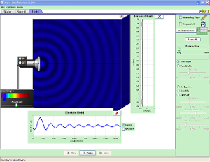
The geometry and trigonometry of interference patterns is non-intutive to students. I think it's non-intutive to most of us. Doing real lab work in this area is recommended. But the equipment and time requirements can be daunting.

This sim can be used in conjunction with a lab activity, or in place of one (in a pinch). Its intent is to develop the basic relationship governing the geometry of a two-slit interference pattern, and then to work with that relationship.

The activity uses the PhET sim, Wave Interference.

The Fringe of Optics (PhET page).