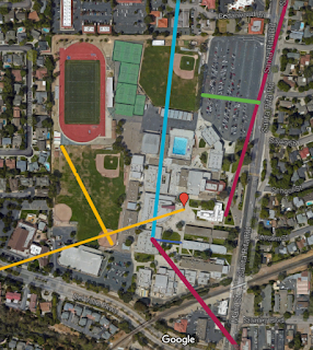
 I've found a few times that using Google Maps is helpful to create maps for scale. At the beginning of the year students practice their understanding of scale with this Group Measurement Activity (pdf or ppt here). I've incorporated images from Google Maps before for lectures on measurement but they have not been interactive. I just made this map (at right) of different distances from 50 m to just under 2000 km using our campus as the 0 m mark. You can view the distances in two layers, <5 km and <2000 km.
I just came up with this strategy for my Physical Science class when we studied the layers of the Earth. I gave each student a printed map of the US and showed them this map (below) with different line segments representing the average thicknesses of the different layers of the Earth. Students were able to transfer the lines to their own map.
While the level of students necessitated this format, I would like to try having students find their own lengths for these thicknesses. Using laptops or tablets students would be able to make their own Google maps based on these thicknesses, or any other values I want them to gain an understanding of.
One of my favorite random facts about the electromagnetic spectrum is this quote from a NOVA documentary:
“This understanding of planetary processes is based upon data from satellite instruments spanning a wide range of wavelengths of the electromagnetic spectrum, almost all invisible to the eye. As one scientist explains, if the electromagnetic spectrum were stretched the three thousand miles from New York to California, what we can see in the optical range would take up the space of a dime."
While I have used an animation within Powerpoint to illustrate this in the past it is not to scale. While I was playing around with maps, I created a quick map with only two parts: a line from Los Angeles, California to New York City, New York and a marker in the middle of an intersection in Wichita, Kansas. The distance from LA to NY ended up 2,450 miles but the scale is still impressive. I would show students the whole US and then zoom in on the green circle representing the dime on "main street USA" right in the middle of Kansas. The quote is interesting on its own, engaging as a simple picture but I hope it will be more powerful as an interactive map.

No comments:
Post a Comment