All I can do is opine that we will very likely need to increase our reliance on nuclear power generation in the future, so we very much need to get it right and pay particular attention to details. Low-bidding and shoddy construction at a coal plant can have bad consequences. The same at a nuclear plant can be widespread devastation. The consequences are too severe for us to be anything less than brilliant on design and construction.
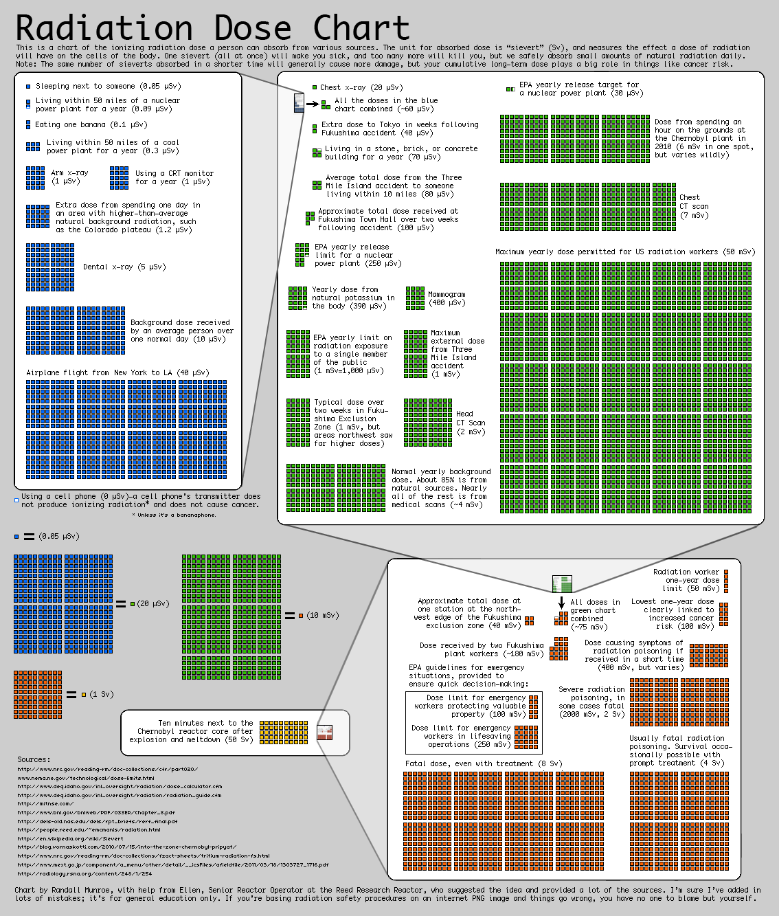
Anyway, in our efforts to Know Nukes, XKCD has prepared a nice chart. Worthy of printing on whatever large-format printer you have access to. It makes a graphical display of radiation doses from natural background up to lethal.
And West-coasters, it's still safe to play outside.
XKCD Radiation Chart
3 comments:
I find this chart is often quite confusing because the dose per unit time varies widely. The one day dose (~3.6 mSv) at two sites near Fukushima if fairly constant for the time since the disaster is already at the one year dose limit for a Radiation worker and if it continues for a month would be over the one year dose clearly linked to cancer risk, but would have been absorbed in only a month. It seems misleading that it is colored green since we have no way of knowing how long the level of radiation will remain high in that area.
Darn, I just ate 15 million bananas!
Most of the danger is not from radiation levels it is from leaked radioactive substances. The chart does not put Fukushima in context.
Post a Comment