Let me just say at the outset that this post is Reason I'm a Terrible Person #417.
I was scoping out the YouTubes in search of a nice video lesson on the photoelectric effect. Demonstrating the effect can be troublesome and finicky. So why not enjoy the fruits of someone else's labor?
I watched through Adam Micolich's lesson (below) and... found it wanting. Wanting to be used as a lesson in skepticism and critical thinking!
The story/script is nicely straightforward:
1. A negatively charged electroscope is discharged via exposure to ultraviolet light.
2. The UV light is causing the discharge: a glass plate blocks the UV and prevents the discharge.
3. The UV liberates electrons: a positively charged electroscope is not discharged by UV light.
Let's see how it goes. (The actual photoelectric demo begins at about 2:50.)
Each segment seemed to go according to plan and proved the aspect being investigated. The content as spoken is spot-on correct.
And I have no reason to suspect shenanigans. But in my judgment, the demonstration is flawed to the point it would be fraudulent if done intentionally.
Consider it a PhyzMaster Challenge: Can you find the flaws I found?
I offer this challenge in good faith as an exercise in physics-based critical thinking. These principles are ostensibly valued by Common Core, NGSS, and the reimagined AP Physics courses. I mean no disrespect to Mr. Micolich. He was good enough to produce the video lesson; I—someone who didn't bother to create a video lesson of the photoelectric effect—spent a Saturday night finding fault with it. So who is more deserving of harsh judgment? (That was rhetorical.)
Hints and specific allegations in the comments. I might remove these later if I assign a skeptical critique to my students.
Sunday, March 20, 2016
Wednesday, March 09, 2016
Hewitt Drew It screencast index page updated
Conceptual Physics author and good friend, Paul Hewitt, recently spent a few years producing 147 physics screencasts. I was overwhelmed at the sheer volume of these gems, so I organized a set of links to the screencasts in a way that was helpful to me as a classroom teacher.
Since I originally launched my index page, several more screencasts were produced. So today, I updated the index page to reflect the new screencasts. Newly indexed screencasts include several concerning special relativity and a couple on general relativity, as well as "appendix" screencasts on sailing into the wind and another about the exponential function (it's more captivating than you might think).
Hewitt Drew It Screencasts
Monday, March 07, 2016
Take Physics: Course advertising–2016 edition

If you want more students to enroll in physics next year, you might consider advertising your physics course offerings right now.
To that end, I post a series of fliers around campus. Over the years, it's actually become a few series of fliers. I'll post each series below as examples. Some you can probably use as is. One will absolutely not work for you.
In any case, you'll want to click each series to see what it looks like.
Series 1: Physics: You Don't Want to Miss It (The Original Series)
Series 2: Physics: You Don't Want to Miss It (French and Spanish)
I print Series 1 and 2 to fluorescent, coated (not dyed) "neon" paper. It's as optically bright as it is hard to come by. Here's the Amazon link I used last time I bought the stuff.
Series 3: Slogan meets Google Translate [I'm confessing that I went too far with this series.]
Series 4: Dank Memes: Take Physics Edition
Series 5: The Groupie Shots (ft. Bill Nye, Neil deGrasse Tyson, and Adam Savage)

The Groupie Shots? You'll need to get your own. Mine will not work for you: some kind of union contract issue, I think.
If you've got posters that you decorate your school with during course selection season, tell us about them in the comments.
Sunday, March 06, 2016
A variable "tuning fork" with volume
 Tuning forks have one job: to vibrate with a single fundamental frequency. Simple tuning forks are often troubled with some harmonics, but the overtones are typically very small in amplitude. The fundamental frequency produced by each fork is determined by its composition and physical characteristics. Most are made of aluminum, and their tone is fixed by the length of their tines.
Variable tuning forks have weights attached to the tines; the location of the weights can be adjusted. The frequency of the fork depends on the location of the weights. Such forks are okay in a pinch, but they're a bit dull for my tastes and their Q factor leaves something to be desired.

The good folks at Next Generation Science (whose corporate name is harder to find via search engine results in the NGSS era), offered an electronic tuning fork (Sound Generator) that could produce tones at 400 Hz, 600 Hz, and 800 Hz.
But wouldn't it be nice to have a small-scale, full-spectrum variable tuning fork? Perhaps you already do.
 There are frequency generators aplenty available for smartphones. (I have FreqGen, but that one seems to have vanished from the iTunes Store.) What's important is that you can adjust the frequency of the output tone down to the hertz. You can turn your smartphone into a variable tuning fork easily enough. But much like a tuning fork, the smartphone's sound doesn't carry out to much of a volume. The common solution is to set the tuning fork into a resonance box.
But for the smartphone, that's where a portable speaker comes in handy. I have a Bluetooth speaker that is capable of achieving considerable volume. Once the speaker has been paired with the phone, you can unleash whatever frequency you like at volumes that can annoy people and animals for many meters all around.
I don't recommend blasting out 16,000 Hz at full volume simply because it cripples teenagers while leaving you oblivious. That's just cruel. Every time I do it, my students hate me for several minutes.
Use this newfound tool for good, not evil. It could be leveraged in a "speed of sound" type lab. I'll share my primary use for it in another post.
The Bells of Pasco
One of the first things I purchased for my physics program (using other people's money) was Pasco's Lenz's Law Demonstrator. At the time (1988), it was $55. I remember thinking that was a tidy sum, and that I should probably have cobbled together a home-made version of it myself. As my mentor, Steve Keith, often said, "Why buy something for $50 when you can make it yourself for $60?" But there I was, with the "store-bought" version and a bit of guilt.
The apparatus worked great for its intended purpose, but I felt it was important to milk this thing for all its pedagogical potential. I supplemented it with an otherwise identical length of PVC tube to show tubes made of insulating materials produced no effect, and I used an otherwise identical length of EMT to show that iron produced "too much" effect. (Who doesn't love a Goldilocks situation?)
Eventually, I found the aluminum tube did a great job as a blow gun: I was able to shatter whiteboard marker pens that I blew through the tube and toward solid doors or walls, accelerating the pens to speeds unlawful on local highways. The description of this application became my first published article in The Physics Teacher. The inimitable Don Rathjen of the Exploratorium Teacher Institute designed a simpler, safer version of this demo that he called The Marshmallow Puff Tube.
I also found that the tube was capable of producing lovely tones when struck gently at an end with a croquet mallet. The trick there was knowing where to hold the tube (with as light a grip as possible). Serendipitous experimentation shows that different tones can be produced, depending on where along the tube you hold it. The point is amplified if you hold the tube very near the end: acoustically, it's as dead as the proverbial doornail.
The other day I was returning our set of aluminum Pasco Introductory Dynamics System tracks to their storage space when I decided to give them a bonk with the old mallet. I was able to get a nice set of tones out of them. Not as pure and simple as with the Lenz's law tube, but not bad. The Pasco Basic Optics bench, though similar in its extruded aluminum simplicity, was a disappointment as a bell. I blame the permanently attached rubber feet for putting a damper on things.
What exactly one might do with the knowledge that a Pasco track is capable of producing nice tones, I do not know. If you think of something, please share it in the comments. If Bree or I think of something, we'll share it here, too.
And what about that $55 capital outlay in 1988? Considering it's been seen by over 150 students per year for three demos each year for at least 25 years, the expense amortizes out to $55/(150 × 3 × 25) = $0.0049 (less than half a cent) for each student per use in class. There are some things in education that cost more but are worth less. Whatever burden of guilt I attached to the demo purchase has long since been replaced by a buoyant spirit of instructional utility.
Thursday, March 03, 2016
How far is it EXACTLY?
It is often difficult for students to understand relative distances or speeds of objects. It is even harder to go against their ingrained accepted English system of measurements by making them use *gasp!* the metric system. I've been guilty of it numerous times myself by trying to use round, easy to square root numbers in my problems only to have a student raise their hand and meekly ask, "Wait, wouldn't that be as high as the Empire State Building?" or "Wouldn't that break the sound barrier?" etc. Sometimes we go for realism and sometimes I just want them to be able to do the problem quickly for practice.
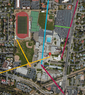 I've found a few times that using Google Maps is helpful to create maps for scale. At the beginning of the year students practice their understanding of scale with this Group Measurement Activity (pdf or ppt here). I've incorporated images from Google Maps before for lectures on measurement but they have not been interactive. I just made this map (at right) of different distances from 50 m to just under 2000 km using our campus as the 0 m mark. You can view the distances in two layers, <5 km and <2000 km.
I just came up with this strategy for my Physical Science class when we studied the layers of the Earth. I gave each student a printed map of the US and showed them this map (below) with different line segments representing the average thicknesses of the different layers of the Earth. Students were able to transfer the lines to their own map.

While the level of students necessitated this format, I would like to try having students find their own lengths for these thicknesses. Using laptops or tablets students would be able to make their own Google maps based on these thicknesses, or any other values I want them to gain an understanding of.
One of my favorite random facts about the electromagnetic spectrum is this quote from a NOVA documentary:
I've also started playing around with a map that compares the distance traveled by sound to the distance traveled by light but I'm quickly finding the difference in scale will be cumbersome. Its hard to compare sound (very fast) with light (faster than you can imagine something moving). What other ways could you use this tool in a science classroom?
 I've found a few times that using Google Maps is helpful to create maps for scale. At the beginning of the year students practice their understanding of scale with this Group Measurement Activity (pdf or ppt here). I've incorporated images from Google Maps before for lectures on measurement but they have not been interactive. I just made this map (at right) of different distances from 50 m to just under 2000 km using our campus as the 0 m mark. You can view the distances in two layers, <5 km and <2000 km.
I just came up with this strategy for my Physical Science class when we studied the layers of the Earth. I gave each student a printed map of the US and showed them this map (below) with different line segments representing the average thicknesses of the different layers of the Earth. Students were able to transfer the lines to their own map.

While the level of students necessitated this format, I would like to try having students find their own lengths for these thicknesses. Using laptops or tablets students would be able to make their own Google maps based on these thicknesses, or any other values I want them to gain an understanding of.
One of my favorite random facts about the electromagnetic spectrum is this quote from a NOVA documentary:
“This understanding of planetary processes is based upon data from satellite instruments spanning a wide range of wavelengths of the electromagnetic spectrum, almost all invisible to the eye. As one scientist explains, if the electromagnetic spectrum were stretched the three thousand miles from New York to California, what we can see in the optical range would take up the space of a dime."
While I have used an animation within Powerpoint to illustrate this in the past it is not to scale. While I was playing around with maps, I created a quick map with only two parts: a line from Los Angeles, California to New York City, New York and a marker in the middle of an intersection in Wichita, Kansas. The distance from LA to NY ended up 2,450 miles but the scale is still impressive. I would show students the whole US and then zoom in on the green circle representing the dime on "main street USA" right in the middle of Kansas. The quote is interesting on its own, engaging as a simple picture but I hope it will be more powerful as an interactive map.
Subscribe to:
Comments (Atom)