On one hand, it's a very kinetic presentation. Sight, sound, and motion. Nearly all of it could have been done in Keynote. (Do I need to add that nearly all of it couldn't be done in PowerPoint?) So yes, it's very flashy. And it beats traditional content-delivery presentations by a mile.
But for my tastes, it's too much. Too much information (mostly trivial), too fast. Too many wind-whoosh sounds to emphasize how quickly the information is whipping by.
Maybe I'm missing the point. Maybe this series is all about a big clusterdump of trivia presented as infotainment. If that's what it's trying to do, it does it well.
See for yourself.
OK, now let's get at the errors.
1. The "90% of people who are struck survive" line is terrible. The stat may be true, but the vast majority of those survivors suffer permanent, debilitating injuries.
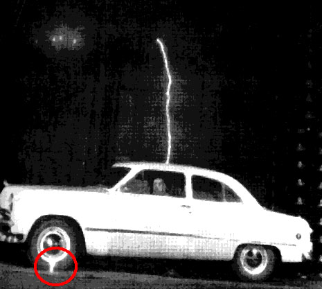
2. With so many stock photos of cars, why did they have to choose a ragtop Cadillac? A convertible may not be so safe if struck by lightning. Better to have metal over your head. Canvas makes a lousy Faraday cage.
No comments:
Post a Comment