This first year of teaching AP Physics C: Mechanics and Electricity & Magnetism has had lots of lessons, one of which I was not expecting. I assumed (and you know the old saying about assuming anything) that students in AP Calculus or Multi-Variable Calculus could graph data. And I was wrong.
Well to clarify, they can graph but they often choose not to. Be it innate teenage laziness, prioritizing their overwhelming workload, or even just forgetfulness, my students don't spend the time on their lab graphs that I would expect. My expectations were laid out at the beginning of the year, as they were in regular Physics and I'm sure every science class they have ever taken. They are summarized below:
1. All plotted graphs (not sketches) should be at least a half a page in size and made on graph paper.
2. Axis and best fit lines should be made with a ruler.
3. Each axis should be labeled with the quantity and units. Each axis should have a uniform scale but it need not be the same from one axis to the other.
4. The graph should have a descriptive title (i.e. not "Graph #3").
5. If multiple data sets are plotted use different colors and/or different data point symbols. Include a legend.
6. Add a best fit line or curve to your data that gets as close as possible to all of your data points. Do not "connect the dots." If the best fit relationship is linear include a slope triangle to calculate the slope of the line.
I don't feel that any of these requirements are too extreme, strict or beyond what they are being taught in math class. Yet as the year has progressed I have seen the graph quality decrease. The occasional student "forgets" to do it on graph paper; I may let it slide. Once in awhile someone makes the graph too small and I'll draw an unhappy face on it in red pen. The mistakes were becoming more common but due to drowning in curriculum development I kept ignoring the growing problem.
But then it became too big. Last week I collected student lab notebooks with two labs in it. One required several graph sketches (just a variable labeled axis and a general shape, no plotting) with two plotted graphs and the other only required two plotted graphs. Students had begged for additional time for lab notebooks and after agreeing I joked that I was expecting perfection.
I did not get it.
It started with one unbelievable graph. Bad enough that I snapped a picture and posted it on my Twitter feed. Then there was another. And another. I collected enough of the "worst" that I decided that I had to have a little "talk" with my classes about quality of work. I assembled them into a powerpoint and planned the reckoning.
The big day was today and I had it all set up to make the big points in an amusing way, but letting them know I was serious. I started each class with, "I graded your lab notebooks. We need to have a bit of a chat. What math level are you in again?"
Students warily reply "Calculus..." because they know they're getting set up.
"Oh that's right," I reply, "So you should be able to make a graph right?"
They nod.
"Well, I thought so too, but we need to talk about that."
In one class a student said, "Oh man, she made it into a powerpoint, that can't be good."
I assured students that these contributions were anonymous, and that if their graph was included I still care for them and I know that they can do well in Physics. They just had a big "oops" with this graph.
We proceeded to flip through the examples, with a mixture of roaring laughter (to the point of tears for some) and absolute disbelief.
They had questions:
"Someone turned that in?"
"Is that a hole in that paper?"
"What is that line even supposed to be doing?"
"Were these all from that one assignment?"
One student at the end said, "Wow, and we had extra time so you wanted them to be perfect." Yeah kid, I was shocked too.
In the end it was a funny way of reminding them of my expectation, and now I have a collection of some of the worst graphs I've ever seen. Of course I would rather not have had the situation at all but at least we can all benefit. The collection is available as a pdf and individually below. Feel free to use in your classroom for the same purpose, hopefully they help you avoid your own #GraphFails.
 |
| Only one data point really? No ruler used for the axis, not made on graph paper, no slope triangle and the best fit line doesn't even go through the single data point! |
 |
| One of my students said that this apparent best fit line (that completely missed every data point) might be a Z-axis. I don't know if that makes it better. And no, seeing the grid through the back side of a blank piece of graph paper doesn't count. |
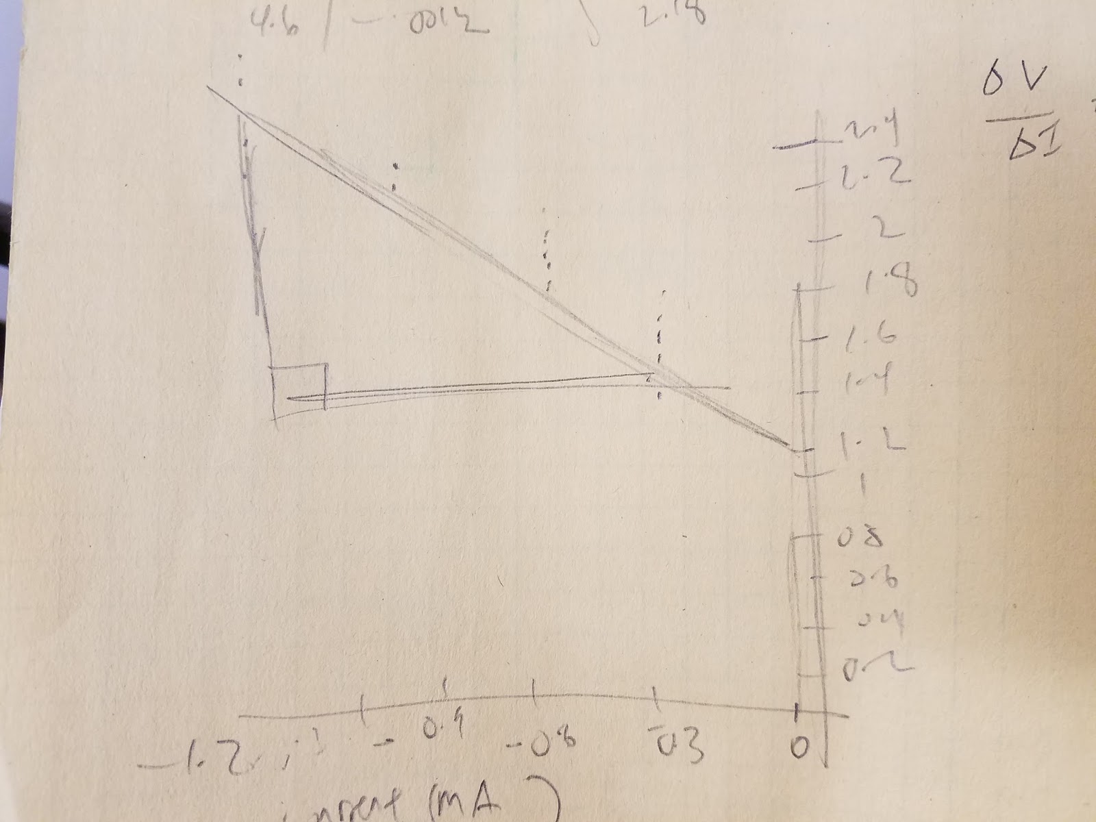 |
| Not on graph paper, not made using a ruler and made a thicker line (potentially to hide poor data). Actually I don't even know if these data points are even properly plotted. We decided this was more of an artistic representation of someone else's graph than a graph itself. |
 |
| Students often ask to use Excel, and they can, as long as they can use it right. This is not right. I have no idea how that best fit line worked with that data. |
 |
| These are supposed to be sketches, not plots, with a variable on each axis. That pen tip is for scale. Yes they are that small. |
 |
| If you're asked to make a slope triangle on your graph it will probably be linear. When in doubt, the student apparently thought drawing a slope triangle would help anyway. |
 |
| When I said a "uniform scale on each axis" I didn't think I need to be specific and say you need more than one number to establish a scale. |
 |
| Of course having no scale is worse. |
 |
| The large data points on this were annoying but not terrible. It was the sneaky breaking of the graph that they tried to slip past me. |
 |
| When your data doesn't seem to have a trend, I guess plugging it into a calculator is one way of finding a best fit line. |
 |
| Then again, even if the best fit line seems obvious maybe you should use your calculator to double check. |
 |
| Sigh. |